Hm, I can see the appeal on books, but it's awkward to keep turning the monitor over. People are starting to stare. --PlasmonPerson
Use PSP, and rotate the image 180°. Less hard work on the arms, too. --M-A
It might help to remember that there's no reason it has to read the same upside-down and rightside-up. That might allow better results. --PlasmonPerson
Interpretation 1: You are being silly... again. Go and read the title of this page, then come back when you know what's going on.
Interpretation 2: Indeed, some of the best examples of this seem to be when you take two words, and make one read like the other upside-down. (See "Elements in Balance" on the Ambigram page. --M-A
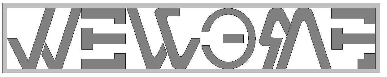
Just the one for the moment - an ambigram on "Maths". I'm not ecstatic about the "hanging" s/pre-M-tail, but it could be a lot worse:
I don't think the hanging tail is a problem at all - I'm impressed by your making an entire S disappear. The problem to my eye is the lowercase A: it takes a bit of effort to bind it to the right rather than the left. I wonder whether making it a circle with two diametrically opposite tails might work better than merging it with the M and the T. I might also be inclined to break the crossbar of the T away from that of the H, to make the H more distinctive. I do like the way you get two and a half letters out of the M: it reminds me of the way Scott Kim did the [same thing]. --AC
And secondly. This feels a little contrived, particularly the capital A. Improvement suggestions welcomed.
Ooh, I like the capital R / e l. You're right about the problem with the capital A / c h, though. I wonder if you could make a lowercase A (handwritten style) do the same job? Fitting the H (probably lowercase) into the gap in the C to make the whole circle of the A? --AC
M-A's attempt at "Rachel" (OK, you've got me hooked now...):
Eh? Works from multiple different browsers and multiple computers here. Or are you using a text-only browser? --AlexChurchill
No, IE on a Mac. I get a little red x and the text saying 'Image: 122' (without the space) - SunKitten
Further to that, it works in Netscape Communicator (nice Ambigram :) but even on the Image Server list in IE I get just the little red 'x' - SunKitten
Works here. I would guess, then, that that version of MSIE predates PNG files. You can find out for certain by going to a [known working page with PNG images]. Do any of them work? (NB the thumbnails Google displays are JPEG, you have to actually go to the page with the original image). The image server now displays MIME types in the [image list] - do any of the PNG?s work for you? - MoonShadow
Yup, I can see all those PNG images and the others on this page - only 'Rachael' doesn't work >.< - SunKitten
Bizarrely enough it's now working - on the same computer with the same IE as before ^^;; It is very pretty :) - SunKitten
Heh. For obvious reasons I have also created a similar ambigram, although the lack of a second "a" caused slight problems. I will wikify it sometime. I am currently entertaining the person in question, so rather nicely I don't have much free time. --ChrisHowlett
Oo, cool. How similar did it end up to the above? Did the middle section look anything like , or did you do it differently? --AlexChurchill
No, I had to use a capital A, which I'm not too happy with. See above. I might give your method a go, it looks like it might be more promising. --CH
And I've shamelessly borrowed part of the logo to make this more instantly recognisable: Using up two O's in succession would normally be horrendous, but it kinda works here.
One more. And my first foray into using drawings of non-abstract things as part of the work. Comments welcome.
Muchly like :) - SunKitten, wondering about T-shirt possibilities ;)
The next couple may not be so obvious, as I've been trying English / Japanese ambigrams. I thought Scott Kim's [couple of][bilingual ambigrams] were a bit of a cop-out, as he's just ignoring most of the English lettering. I wanted to try to make a one-to-one transformation, not just use part of it. This is potentially challenging, as most Japanese characters represent two or more English letters. Nevertheless, here's my attempt at the word "Mizuiro" in both English and hiragana in the same orientation simultaneously: (For reference, "Mizuiro" in hiragana in one of the standard Microsoft fonts looks like this: )
And a tesselation of my name: this way up it's in English, turn it upside down for the same in katakana.
This one has been adorning the glass in TheShrubbery's front door for a few weeks now. Mirror-symmetry is much harder to physically plan than rotational: thin paper and heavy ink helps. Click [here] to see it mirror-flipped.
Is it just me, or is there a missing 'c' (or missing 'o', depending on how you look at it )? --M-A
It's you, although the 'c' does look very much like an 'l' at first glance... - SunKitten
I'm inspired. I'm now working on a small one. Bezier curves in PSP are the way to go...
OK, here goes...
'Fraid that unless you make an effort it just looks like 'NN'... Plasmy
I know, but it was only my first attempt... and it's reasonably pretty, at least. :) --M-A
That it is.
Take 2:
Is that better? P.S. It doesn't say "M-A", for those who might be wondering... --M-A
Yes, that is quite a lot better, for all that it's not very different :) I think the curve at top-right / bottom-left could stand to be diminished further: it reduces the visual cue of the T while contributing nothing to the N either. But much more readable, and as you said, pretty :) --AlexChurchill
I disagree - I think the curve adds to the aesthetic quality of the N (it matches the one on the right-hand stroke). But that's quite subjective :) - MoonShadow
You're probably right, actually. It feels to me like the top of the T is off-centre compared to the vertical stroke... but rather less so than in the previous version, and the N does work better with that curve. And it couldn't be diminished much more without turning into a right angle which would clash with the flowing curves of the rest. It's probably just a sideways shuffle of that horizontal line that I want. Objection withdrawn :) --AlexChurchill
And take 4... (the flourishes on take 3 made it worse)
Hmm, it's not very good; and it looks better on my pen drawing. Where's a vector graphics tool when I need one?
A couple of thoughts that occur to me here (though I'm no professional graphic artist, so take it or leave it): * The "I" can be made much easier to read by adding a dot above it (and optionally shortening the stem). The eye completely ignores the dot at the bottom, but it's a very strong cue at the top. * The separations between different letters don't have to be as large as you're making them; I think we're more used to seeing letters joined together than breaks inside letters. The N / H doesn't have to be broken at all, although I'm guessing that was deliberately done that way for stylistic consistency with the rest. For example, if you add the dot to the I you can probably join the top of the M, although not everybody would choose to. --AlexChurchill
My first attempt: (It looks as though it was handwritten by a dyspraxic octogenarian on a bad day, due to my incompetence with graphics software, but the idea is there, and someone can tidy it up if they want to.) CategoryGames